Typography is everywhere. From the moment you wake up and check your phone, to reading street signs, menus, or websites like this one, you’re constantly surrounded by type. Yet, most people rarely stop to think about it. In this post, I’ll share how I became interested in typography, why it matters, and some practical tips for making better typographic choices.
My interest in typography
I became interested in typography as a kid, growing up with computers and text editors. I remember playing with WordArt and downloading fonts for school projects.
Typography has two main objectives, which are not in competition:
- It makes reading easier. I read slowly, and sometimes lose track of lines. Good typesetting helps with that.
- It’s a form of expression and creativity. Typography can even be a tool of oppression (like when Times New Roman is enforced for every assignment!).
- I like graphic design and making things visually appealing.
Overall, typography is something ubiquitous that is often overlooked.
Modern typography
It’s easy to think there’s not much room for innovation in typography. After all, every font can seem like a subtle variation of Helvetica or Times New Roman—too subtle to be noticeable by the uninitiated.
But once you start paying attention, you can’t unsee the differences. Even small changes in letter spacing (the space between characters) or the shape of a single character can have a big impact on readability and mood. Most well-known fonts pre-date computers and screens; they were designed for print. The design challenges they addressed were very different from what we face today. Modern fonts are often designed specifically for screens, so they remain clear and readable even at small sizes.
Take Helvetica and Inter, for example. At first glance, they might look almost identical—both are clean, sans-serif typefaces (fonts without the small projecting features called “serifs” at the ends of strokes). But Inter was designed specifically for digital screens, with larger x-heights (the height of lowercase letters), wider letterforms, and more open counters (the spaces inside letters), making it more readable at small sizes and on low-resolution displays. Helvetica, on the other hand, was created for print and can feel cramped or less legible on screens, especially at smaller sizes. These subtle differences can have a big impact on the user experience, even if most people can’t immediately articulate why one feels easier to read than the other.
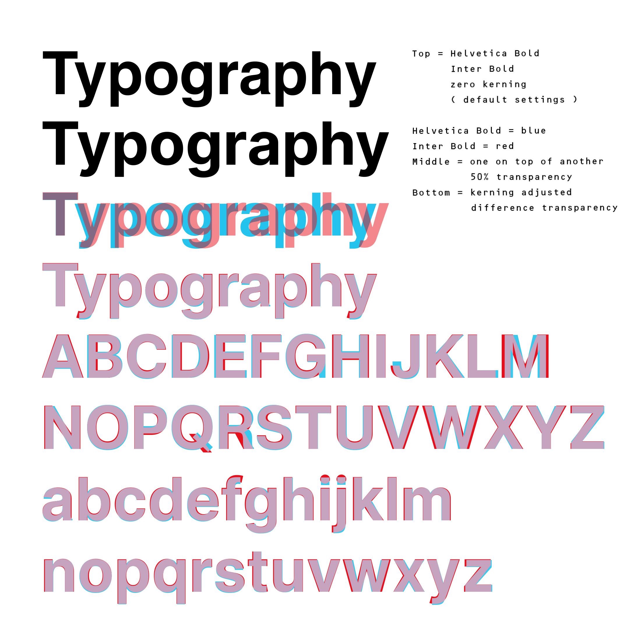
Comparison of Helvetica and Inter typefaces. Inter is a more modern typeface focused on keeping readability in small displays, hence the simpler shapes.
A sidenote: OpenDyslexic
OpenDyslexic is a typeface designed to improve readability for people with dyslexia. It even has a Google Chrome extension for easier web browsing.
Optical sizing
No matter how well you design your typeface, it will only work well for a given range of sizes—especially for serifs. Imagine a typeface with very pointy, elegant serifs. It might look great for large titles, but as you reduce the size, those thin details can become too tiny and disrupt the balance of the type.
Optical sizing is a feature in some modern fonts that automatically adjusts the design of the typeface depending on the font size. For example, at smaller sizes, the font may have thicker strokes and more open counters to improve legibility, while at larger sizes, the details can be finer and more delicate. This ensures that text remains readable and visually balanced, whether it’s used for body copy or large headlines.
Variable fonts
I bet you’ve been in a situation where you wanted to highlight a word, but the bold font was too bold, and you wished there was a middle step. Some font families now come with multiple weights—regular, medium, semibold, bold—providing a helpful gradient of emphasis to play with in text and titles.
This solution works, but there is something better: variable fonts.
Variable fonts are a recent innovation in typography. Instead of having separate files for each weight or style (like regular, bold, italic), a variable font contains all these variations in a single file. This allows for smooth transitions between weights and styles, giving designers much more flexibility and control. For example, you can fine-tune the thickness of your text to perfectly match your design, rather than being limited to just “regular” or “bold.”
Typography in my website
On this website, I’ve used the Fraunces variable font. It has four different variable axes, letting you go from a wonky, bold typeface to a refined, thin typeface with mid-century flavour.
The quick brown fox jumped over the lazy dog
There are multiple ways to integrate a font on the web. One common solution is to use Google Fonts, but that might come with a privacy cost.
When you use Google Fonts, your website visitors’ browsers make requests to Google’s servers to download the font files. This can potentially allow Google to track users across different sites. If privacy is a concern, self-hosting fonts or using a service like Fontsource, which lets you load open-source fonts as NPM packages and serve them from your own server, is a better option.
Favourite fonts and when to use them
- Computer Modern — The classic typeface of science and academia. Serious but beautiful, and very legible for long-form reading. Great for reports, academic papers, and anything that needs a touch of tradition. Designed by Donald Knuth!
- Fraunces — Variable, funky, and versatile. With so many styles, it’s elegant but never boring. Perfect for headlines, branding, or anywhere you want personality and flexibility.
- Noto family — A recent project by Google; the goal is to cover all of Unicode, making it ideal for multilingual projects or anything requiring broad language support.
- RymanEco — Designed to save ink when printing, creating beautiful patterns. Best for eco-friendly print projects or when you want a unique, textured look.
Resources
- Google Fonts documentation has extensive content on the knowledge of typography.
- Material design documentation about typography. Short post on typography in the context of Google’s Material design guidelines.
- Stop Stealing Sheep and Find Out How Type Works by Erik Spiekermann. A light introduction to typography, presenting the basic rules supported by many illustrations and curious facts. Good for a light read, but don’t expect an in-depth practical manual.